Responsibilities included in my daily work
- Promote the main concept of a design system to the designers
- Inventory of existing components and used patterns
- Audit new product work in flight, feedback for improved component usage
- Propose and scope new components and features
- Work with engineers to define component properties
- Write functional documentation
- Apply the WCAG accessibility standards to all designs
- Educate designers on accessibility standards
- Community support via active slack channel
- Facilitate recurring DS meetings with the community
- Steward community contributions
- Design visual language and produce guideline
Which problems do we address?
The aim of Waffles is to streamline and strengthening the overall visual coherence of all digital estate and reduce costs in coding.
Historically, very few product teams adapted waffles as a design system. Reasons were technical (different programming languages not compliant with the existing components), but also a lack of guidance in design consistency. Each team individually designing and coding for their own needs has led to various visual solutions to similar UX patterns the teams weren't aware of.
This inconsistency in design comes with a high price – literally and figuratively. it risks reducing loyalty and brand trust from the customers and creates unnecessary confusion. Also due to the multiplied costs of developing the same patterns over and over again, a big loan costs adds on this damage.
Website
The components are built in React and we use the code in our system as the source of truth. The site is custom build with our own components, demonstrating an example on its own of best practices. I redesigned the first version to improve usability as well as scalability.
As a lot of design system teams, we made the mistake not to start documenting right away while adding new components. It was on our agenda already for quite a while, but due to conflicts in planning, we deprioritised it again and again. And when we were about to start, I had to leave the company due to economic savings. This is a big bummer, as well documented components are even more important now I left the company. So much knowledge left with me, but I sincerely hope the two developers can pick up where I left in writing proper documentation.
Figma libraries
As a first step, we switched from Sketch to Figma. Figma as a multiplayer software enhances collaboration, which is super important in a mainly remote team. Further on, auto layout and variants in components make it possible to mimic the way code works so much more accurate. The Figma library today is a 1:1 copy to the coded version, only deviating due to some limitations of the software (e.g. extra variant for responsive behaviour horizontal versus vertical alignment).
By moving to a new platform, we also had the opportunity to structure the files and libraries in a transparent and intuitive way. the two different libraries were assigned to the according teams using it. Templates for Figma files (including page structure and naming conventions) were provided. Every new designer got an intro session getting familiar with the basics of Figma and the way we work.
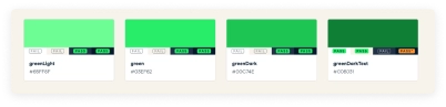
Tokens
We also introduced token integration in Figma, linking to a json file in github as our SSOT. As Figma doesn't provide native support, the tokens are accessible via the “Figma Tokens” plugin and linked to the native Figma styles as much as possible (for typography and colors). Tokens for e.g. transparency or rounded corners are applied to the components. In case of a rebranding or minor updates of e.g. a color value, this can be done in a simple adjustment of the original json file.
This is a first great step in aligning code and design. Hopefully Figma will quickly offer this standard within the app so that less experienced designers also can benefit of the power tokens offer.
Accessibility
Most of our existing components didn't pass the WCAG 2.1 AA accessibility criteria. While rebuilding we also put a big effort in optimising them. On the design side, this would be optimising color contrasts, adding focus states, removing essential content on hover and most of all help designers understand how to design for inclusion.
 — Color contrast ratio's
 Advocacy for designers
Switching to Figma was the easiest part. It was much tougher to convince the designers that the advantages of unified design patterns outweigh giving up total design freedom for each use-case. UI-designers in particular naturally care a lot about all those little details. On our weekly designer review meetings, we softly pointed out how to align, use components nevertheless. Also, we gave lots of tips and trick how to correctly apply color contrast to pass WCAG levels.
Additionally, I introduced a dedicated biweekly waffles design community meeting for all designers. We presented new design ideas, executed designs and new contributions in code to the waffles. We also offered to give advice on any questions, but this part never took off. Design sprints often were so tight that there was not much time of hesitating and improvement, which is a shame.
Another helpful way to help the design community was a dedicated slack channel. In our remote work environment, designer picked this up very easily. Bug reports came naturally. Also I posted via a Figma plugin all Figma releases directly to the channel, as designers overlooked the update announcement in Figma. I also posted Call for Inventories here to collect input for a potential new component.
This way we kept the design community closely connected and involved with our Design System to ensure they keep on using it –> the developers also can implement it.
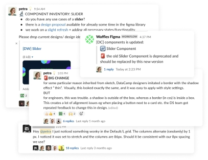 — Slack conversations in the dedicated channel
 Struggles on our way
This was my first opportunity to build up such a big design system from scratch (together with my awesome colleague Matts) – so a lot learning by doing!
On the fast lane
Initially we took things very light: rebuild the existing components in Figma/better code. There were a lot of quick wins, speed was on our side. Along the way, the teams grew, and with it the complexity of requirements, legacy and adoption. It was difficult to justify why things suddenly take so much longer, to the management, the colleagues and to myself.
User contribution and feedback
Designing for a design system is also dealing with different stakeholders. At first, I just came up with design proposals, but there were so many opinions on that as there were designers. I had to find a way to engage them more in the process. I tried letting them design, too. This conflicted with their product team's planning and led to little to no input. We then introduced a flow where I first collected all designs available (from various designers), did research on other design systems, concluded in properties which made sense for our company, and proposed several designs based on the existing use-cases. This was presented in our biweekly, designers had time to feedback and to finetune, before I finished the design.
Management support This is probably the hardest part. When we got green light to start on this journey, both my technical colleague and I were supervised by a high management leader believing in the long term gains a design system will have. We didn't need to sell our product team, which was great. Unfortunately, our boss left the company and our new supervisors put less emphasis on it. On top, the economic crisis hit, and with that the inevitable cost savings. My contract was ended with no replacement for now (two junior UI designers will maintain the Figma library on the side). It is a fact: on short term, the design system team is not profitable, but I strongly believe it is on long term. I guess we missed the boat of continuously advocating on higher management level, actively celebrating our success and actually proving that with measured numbers.
What's next?
I am try thankful for the opportunity I got here at DataCamp. And I think we can be proud of what we archived in a fairly short time.
It is up to my two remaining colleagues to complete our documentation, and to get as many teams on board as possible switching from their custom code to waffles. Next on the roadmap is also the roll-out for marketing (mainly different font tokens and sizing in general).
As for me, I will move on to the next big adventure (and if you think I can help you, feel free to contact me)
Discover more projects